Art Director + Designer


The Design
Toyo Ito is a Japanese architect accomplished in the field, having won the Pritzker Prize in 2013. His expression of structural and virtual experience have led him to be among the most influential and innovative of designers.
Ito’s approach to architecture involves directing attention to common conventions of structure and space in order to emphasize aspects of design that tends to be overlooked. He believed that certain aspects of design seemingly invisible to the viewing audience were, in fact, the most significantly impactful components to architecture itself. With this attitude, Ito's structures essentially borrowed from the governing principles of the natural world, mimicking the quintessential element to all life - air. To exemplify his appreciation of organic flow, he designed buildings to unify spaces and create openness within walls, ceilings and floors; ultimately creating seamless fluidity, representing the nature of how air flows and bends into new environments. Through both abstraction, and literal depiction he experimented with a shift in hierarchy between aesthetic and functionality. Evident in The Sendai Mediatheque in Japan, the most striking visual component to the interior (and exterior) space are the large angular columns running perpendicular through each floor. Within these elegant columns run several airway systems which emit a soft vibration in intervals as air is funneled through. The rhythmic pattern of air passing, and the subtle tone in a sense, resemble the breathe of organic lifeforms. Ito understood this as an important aspect of the design, and allowed for it to be in the foreground - figuratively giving the notion that even cold, inanimate structures can be animated in order to demonstrate the influence of invisible material.
He avoided the rigidness within modern buildings and gravitated towards unorthodox or curved skeletal structures which resembled the unpredictability of growth within plant-life. Plants themselves grow depending on the direction of light and carbon dioxide - examples of ethereal matter. Through his architecture, Ito was successful in transitioning to the foreground the simplest characteristics of nature; communicating the disposition that they are the most important attributes when considering the design.
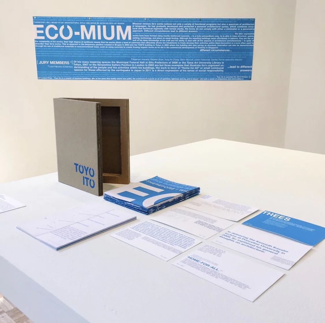
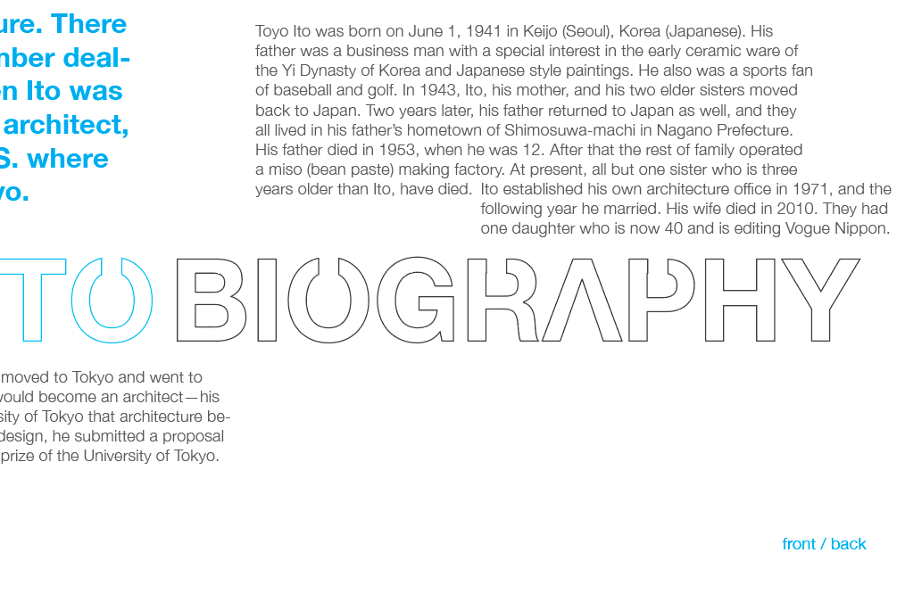
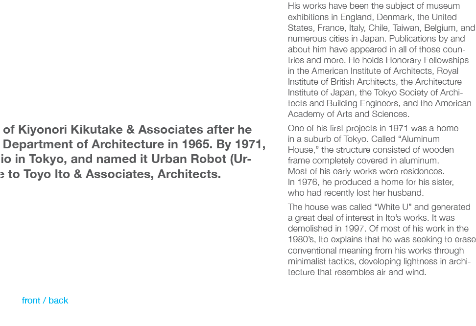
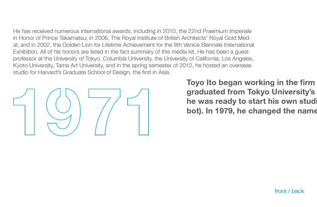
I considered Ito’s approach and (within the confines of typography, and form,) decided to break the conventions of a book, poster, card, and package by taking away the luxuries of functionality making the "invisible" elements known. You'll notice that I adjusted the binding of the book so that it would ultimately force the reader to hold on to the margins (as an individual would do naturally)in order to keep the book from closing itself. Then, I increased the scale of the poster to emphasize the reliance on size when performing its duty. The line length, and size of the type is exaggerated, and as a reader, you would need to view the poster from a distance - allowing the recognition of scale. When designing the card sets, I neutralized the idea of a “front” and "back," (which are characteristics I felt were critical to the idea of a 2-dimensional platform) by allowing text to continue onto both sides. By doing this, the reader is attentive to how a card is supposed to behave - thus leaving the question of which side to read first. Lastly, when considering packaging, cardboard was used in excessive amount to underline the utilitarian characteristics of a package. The simple, non-visually stimulating exterior of the package is shed of it's superficiality, leaving the reader with elements of industrial type treatment and corrugated lining. In a sense, these elements, when left alone in the light, assume their own beauty, ultimately commenting on the controversial realtionship of form and function.